Sex signage: Was McLaren inspired by Lubalin’s cladding for the Georg Jensen flagship NY store?

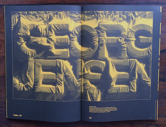
//Detail, clad signage for Georg Jensen, 601 Madison Avenue, late 60s. From Herb Lubalin: Typographer, Unit Editions, 2016//

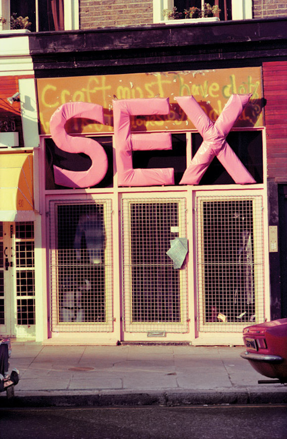
//Detail, shop signage designed by Malcolm McLaren, made by Vick Mead, 430 King’s Road, London, 1975. From a photograph by Peter Schlesinger//
Was the late Malcolm McLaren inspired by one of the greats of 20th century graphics in his creation of the astonishing signage for Sex, the fetishistic fashion boutique and incubator of punk rock he operated with Vivienne Westwood at 430 King’s Road in west London between October 1974 and November 1976?

//From Herb Lubalin: Typographer, Unit Editions, 2016//
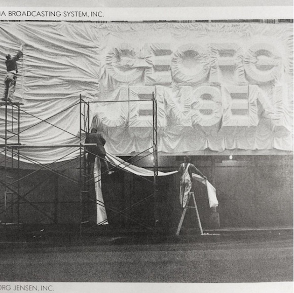
Difficult to say for sure. The fact is that the American graphic designer and typographer Herb Lubalin – best known for his groundbreaking work for a range of corporate clients and on the magazines Eros, Fact and Avant Garde (for which he produced the widely used typeface of the same name) – came up with a solution for protecting the facade of jewellery chain Georg Jensen while its flagship store in New York was under modification.
By arranging for the front to be draped with protective material, the block lettering of the store name became visible in an unusual way. “This ingenious temporary sign indicates the store’s location and deftly alludes to the fact that it was still ‘under construction’,” note Tony Brook and Adrian Shaughnessy in their book Herb Lubalin: Typography.

//Herb Lubalin designed this protective draping of the shop sign. Photo from @lubalincenter, The Herb Lubalin Study Center Of Design & Typography’s Instagram feed//
Lubalin’s handling of the Georg Jensen lettering was subsequently published in several American design books and magazines. In early 1974, having returned from New York a couple of months earlier, the avid reader and researcher Malcolm McLaren determined to overhaul the outlet at 430 King’s Road (then named Too Fast To Live Too Young To Die).
The skull and crossbones logo was removed from the front in the spring of 1974 and over the summer he vacillated. As singer-songwriter Chrissie Hynde – who worked as a sales assistant briefly around this time – told Sex Pistol Steve Jones a decade ago, the shop didn’t have a name, just 17th century clergyman Thomas Fuller‘s maxim “Craft must have clothes but Truth loves to go naked” sprayed across the lintel on the facade. This was in the style of the spray-can street art then emerging on the streets of NYC which had been noted by McLaren.

//Exterior, 430 King’s Road, 1975. The shop’s temporary name from a Thomas Fuller maxim was retained underneath the sign. Photo: Peter Schlesinger//
At one stage McLaren toyed with the idea of rebranding the premises “Gym”, since he proposed “a sort of sexual gymnasium”. Carpenter Vick Mead provided gym-style wall-bars from which the stock was hung, and McLaren even had a retail interiors specialist tender a logo, but this was rejected and by the autumn of 1974 the brutal representation of the three letters spelling out S-E-X in 4ft high pink vinyl-covered wood (again built by Vick Mead) had taken precedence.
Many believe that the sign was aligned with the soft sculptures of Claes Oldenburg; this is likely given McLaren’s knowledge of art history. But Lubalin’s solution for Georg Jensen does bear tantalising comparisons with McLaren’s construct, so it is my contention that it is worth considering as a point of inspiration.
Herb Lubalin: Typographer is available from Unit Editions here.
