
‘Suburban voodoo is what he did do, so well’: Last two days of Barney Bubbles exhibition at Rob Tufnell London
//Back Cover, Jesus Of Cool, Nick Lowe, Radar Records, 1978. Photo: Bob Bromide. Design © Barney Bubbles Estate//
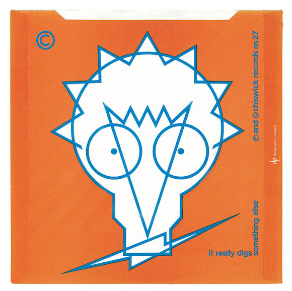
//Back cover, Darling Let’s Have Another Baby/Something Else/It Really Digs, Johnny Moped, Chiswick Records, 1978. Design © Barney Bubbles Estate//
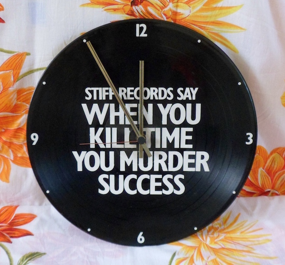
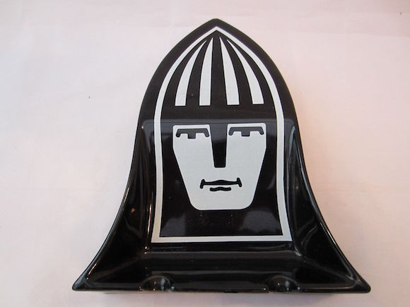
//Clock, Stiff Records, 1978. Design © Barney Bubbles Estate//
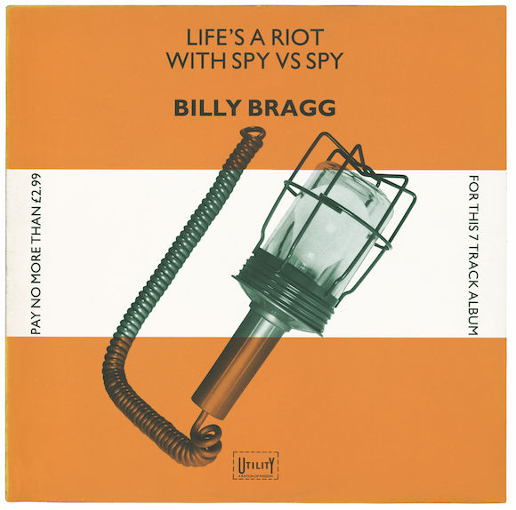
//Front, Life’s A Riot With Spy Vs Spy, Billy Bragg, Utility, 1983. Design © Barney Bubbles Estate//
“In graphics, in the music business at least, Barney pioneered the use of everyday objects in his work. He could see the design and the beauty in the apparently banal”
Suzanne Spiro, artist
The Barney Bubbles exhibition Optics & Semantics at London gallery Rob Tufnell closes tomorrow evening; if you have a chance, do go along and enjoy the late graphic arts maestro’s unique celebrations of the mundane and workaday.
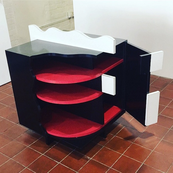
//The Ian Dury Cocktail Cabinet, Editions Riviera, 1981. Design © Barney Bubbles Estate//
Here is the explanatory note I prepared for the show:
Optics & Semantics explores the domestic and workplace preoccupations threaded through the design work of Barney Bubbles.
Having cut his teeth in the 1960s as senior graphic designer for Terence Conran’s homewares empire and numbered among his clients the upmarket Justin de Blank provisions business, Bubbles often turned to the functional and mundane for inspiration.
//Livery for Justin de Blank Provisions, 1968. Design © Barney Bubbles Estate//
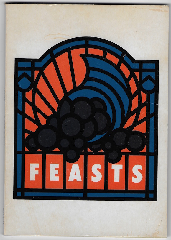
//Jacket front, Feasts, Justin de Blank, 1975. Design © Barney Bubbles Estate//
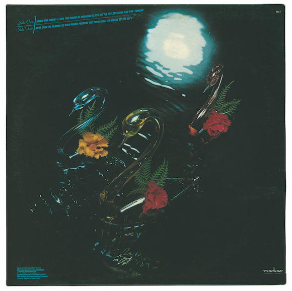
Ashtrays, scarves, matchsticks, tweezers, ring-pulls, combs, decorative glass swans and pottery poodles, lightbulbs, particularly lightbulbs, all these and more were appropriated in the alchemy of spell-binding artwork.
This egalitarian pursuit – where a parking meter achieves totemic status and lampshade silhouettes provide puns on acerbic song-titles – not only played to Bubbles’ allusive approach, but also tipped a wink to the designers of the early 20th century he revered, in particular Moholy-Nagy and his creation of pictograms and the photograms utilizing found objects produced by El Lissitzky.
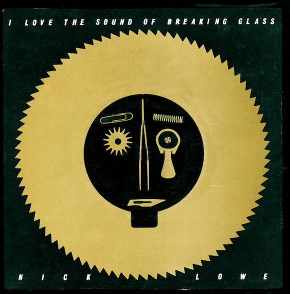
Front, I Love The Sound Of Breaking Glass/They Called It Rock, Nick Lowe, Radar Records, 1978. Design © Barney Bubbles Estate//
//Poster insert, Get Happy!!, Elvis Costello & The Attractions, F-Beat Records, 1980. Design © Barney Bubbles Estate//
It is important to note that Bubbles was born and lived until adult-hood in Whitton, the neighbourhood on London’s south-west edge described by design writer Julia Thrift in a 1992 Eye magazine profile of Bubbles as “the epitome of suburbia”.
This tension in Bubbles’ background, as he grew into a full-blown Beatnik art-student in thrall to the gritty r&b of the Rolling Stones and The Muleskinners emanating from Eel Pie Island, ensured that the Bohemian exotic was often informed by the down-to-earth.
From one of his first LP sleeves, 1970’s acidic warping of a paint-by-numbers scene for Brinsley Schwarz, through the Navy Cut-style logo painted onto a wooden pallet (which was “weathered“ by peppering with air-gun pellets) for folk-rockers the Sutherland Brothers, Bubbles resolutely kept one foot on the ground, even during the highest of times.
//Ashtray, Strongbow Cider, 1967. Design © Barney Bubbles Estate//
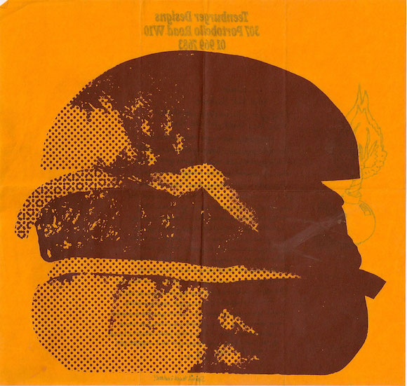
//Letterhead, Teenburger, 1969. Design © Barney Bubbles Estate//
At Bubbles’ sci-fi mythologizing peak as art director for the countercultural collective Hawkwind, daily life was allowed to intrude; lest we forget, their 1974 LP Hall Of The Mountain Grill was named after the Ladbroke Grove greasy spoon frequented by Bubbles and his friends, and the inner sleeve dedication in a caff menu-friendly italic script is credited to “The Legend Of Beenzon Toste”.
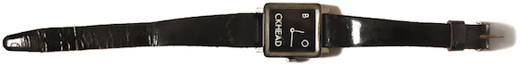
//Watch, Timex, 1978. Design © Barney Bubbles Estate//
Punk’s mid-70s bricolage breakthrough afforded Bubbles free rein: think of the cover of Nick Lowe’s single I Love The Sound Of Breaking Glass – a dolorous face arranged from stray elements including a rotary saw blade, paperclip, ring pull, scalpel blade and tweezers – or Ian Dury’s profile picked out in matchsticks for his ‘Hankie Pantie’ UK tour, or the kitchen mops serving as swaying fans’ heads in his promo video for Squeeze’s Is That Love…
With the encouragement of his friends Jake Riviera and Brian Griffin, Bubbles broke the bonds of the fast-formalising music industry, designing rugs, books, magazines and art-zines, watches bearing the Blockhead logo inspired by memories of the Left Book Club insignia of the 40s, a clock blazoned with a slogan Riviera had spied in a Los Angeles dry cleaners, and a range of furniture to rival the best of post-modern design thinking coming out of Italy at that time.
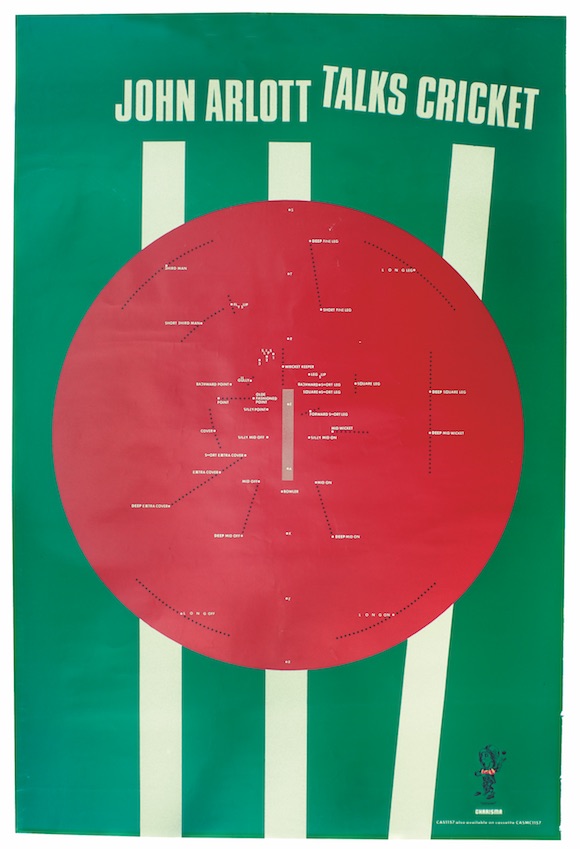
//Poster, John Arlott Talks Cricket, Charisma Records, 1982. Design © Barney Bubbles Estate//
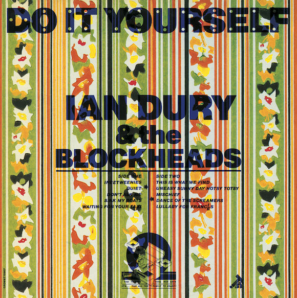
/Front, Do It Yourself, Ian Dury & The Blockheads, Stiff Records, 1979. One of two dozen-plus variants, it was dubbed “Clarence” by Bubbles and Dury since it resembles a work by fabled ceramics designer Clarice Cliff. Design © Barney Bubbles Estate//
The title of a 1982 LP by Paul Carrack, which depicts the singer against a swirling vortex of standard lamp, shade and a housewive’s dress, encapsulates Bubbles at his best: Suburban Voodoo is what he did do, so well.
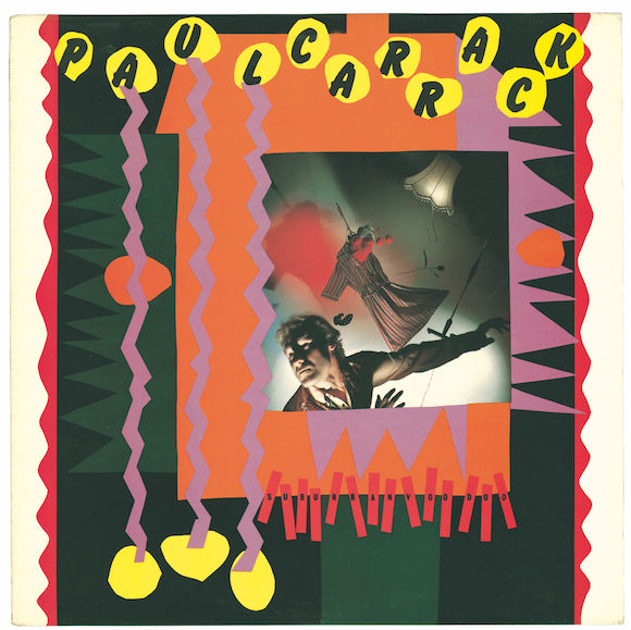
//Front, Suburban Voodoo, Paul Carrack, F-Beat Records, 1982. Photo: Brian Griffin. Design © Barney Bubbles Estate//
Barney Bubbles: Optics & Semantics closes tomorrow (Saturday) at 6pm. It is at Rob Tufnell, 129 Lambeth Walk, London SE11 6EE.
Details here.